
The quality of what you build is everything in construction. It’s what keeps repeat business alive, drives word of mouth, and builds a brand’s reputation. And yet, too many construction firms still treat their website like an afterthought. Even though those bad websites are just as likely to deter clients as shoddy construction.
That’s where this article comes in – we’ve laid out a blueprint that any firm can follow to create a good-looking, highly functional webpage that actually converts.
In this article, we’ll provide:
- Three examples of excellent construction website design.
- Actionable advice for building and maintaining your own company website.
3 Construction Websites that Exemplify Great Design
Each of these construction company websites models effective design strategies for winning clients. Two of them were built by us at Vnzo AEC, and all three provide solid inspiration you can follow for your own website’s development.
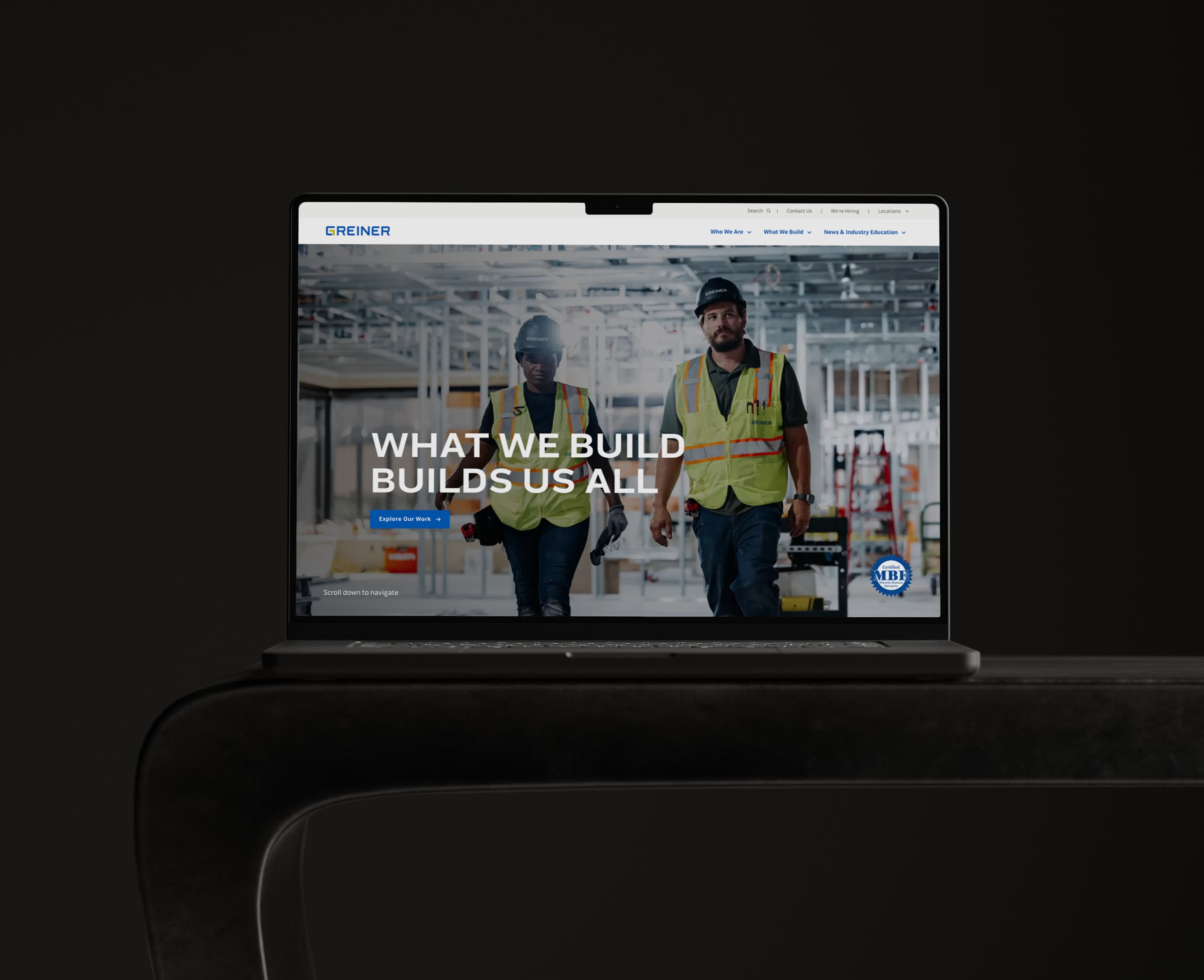
Greiner Construction
Greiner Construction is one of Minneapolis, MN’s top commercial contractors, with nearly 40 years of construction excellence. The industries they serve include multi-family, healthcare, offices, retail, industrial, education, and hospitality. When they connected with Vnzo AEC to rebrand and bolster their online presence, they wanted a website with a message that distinguished them from their competition, so that’s what we set out to accomplish.
Why Their Website is One of the Best: The current Greiner website, launched as part of their rebrand, features a bold and accessible design with a unified message. They opted for a sideways scroll, which immediately sets them apart and creates a distinctive feel. Confident imagery and strong, direct copy greet visitors on arrival, while intuitive navigation helps users quickly get to market sector pages – where they highlight dedicated teams for each market.
Specific features that any construction firm could emulate include:
- A prominent differentiator statement as their primary header.
- Unique copy for each CTA button.
- A side-scrolling homepage that keeps content centered, uncluttered, and easy to follow.
- Clear navigation to market sectors, paired with robust sector-specific pages.
- Seamless integration of both their video podcast (The In Practice Series) and written insights, giving thought leadership a permanent home on the site.

Solid
Since 1981, Solid has been a trusted subcontractor bringing multiple trades under one roof – streamlining projects for builders and delivering consistent quality across framing, demolition, windows and doors, exterior finishes, decking, and interior carpentry. When they partnered with Vnzo AEC, the goal was clear: create a modern website that puts their multi-trade differentiation front and center while showcasing the credibility they’ve built with GCs and clients alike. The result is a polished online presence that communicates confidence the moment you arrive.
Why Their Website is One of the Best: Solid’s website combines strong visuals with a clear value proposition. The homepage immediately sets the tone with high-quality videography and a memorable tagline, while intuitive navigation makes it easy for visitors to explore services, projects, and client feedback. Dedicated sections highlight testimonials from general contractors and feature extensive project documentation – building trust and proof at every step.
Specific features that any construction firm could emulate include:
- A homepage that leads with cinematic videography and a bold tagline.
- Clear positioning of their multi-trade advantage (“All of your trades, under one roof”).
- GC client testimonials woven into the site to build credibility.
- Robust project pages with extensive imagery and documentation.
- Navigation that keeps service offerings and projects easy to find.
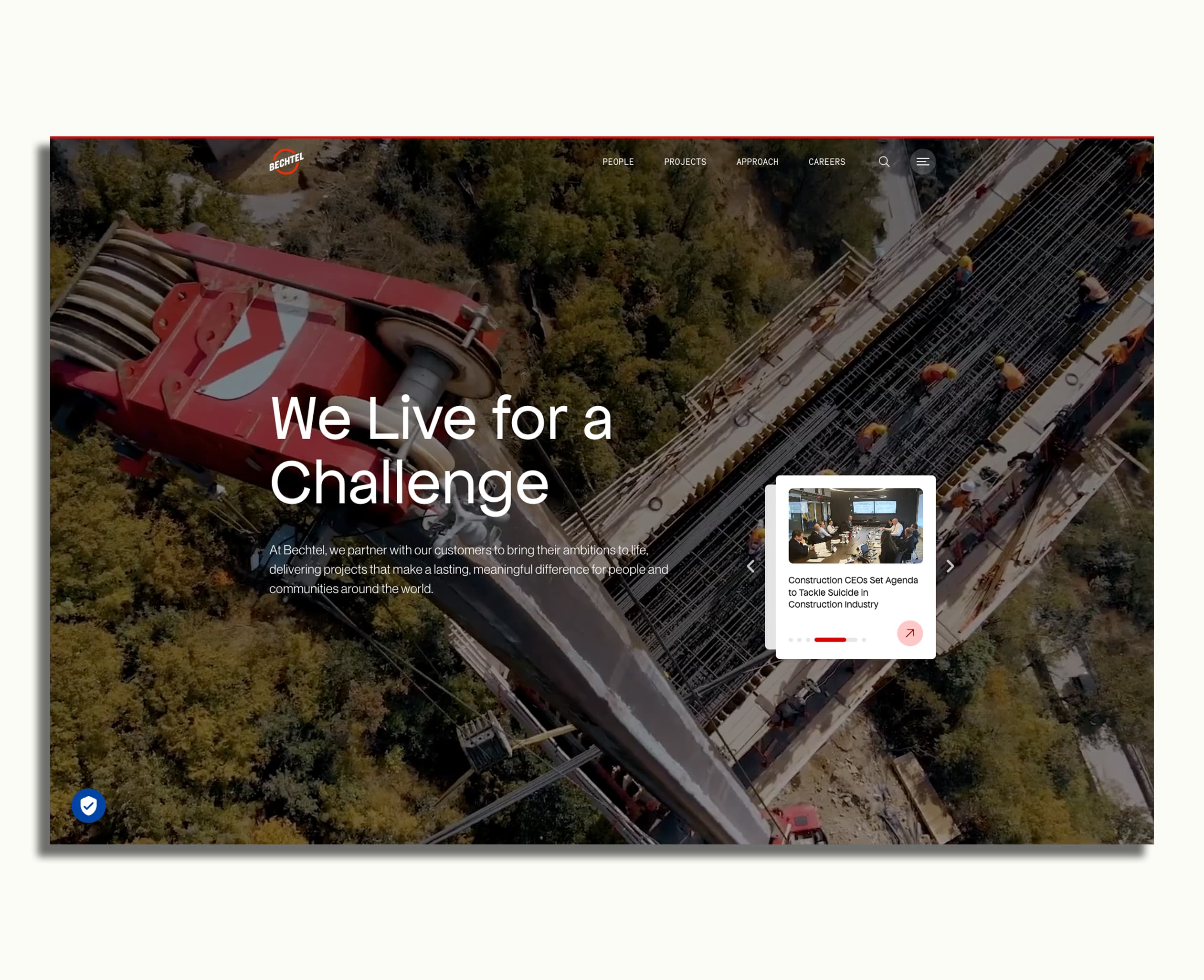
Bechtel
Bechtel is the second largest construction company in the United States, known for tackling some of the world’s largest and most complex mega projects, starting with the Hoover Dam way back in 1931. Of course, their monumental scale mostly makes them an impractical model for other construction companies to aim for. However, their accessible and well-designed website is an exception to that rule, providing plenty of inspiration suitable for companies of all sizes.
Why Their Website is One of the Best: Like Solid, Bechtel leads with more than just imagery. The first backdrop of their homepage features sweeping videography of large-scale projects, deftly meshed with the text “We Live for a Challenge”. Even if visitors don’t know their history, their homepage clearly communicates their differentiator the moment it opens.
Specific features that any construction firm could emulate include:
- Videography and differentiator statement combo headlining the homepage.
- Simple, clean top navigation bar leading to projects organized by industry.
- Consistent use of brand colors, fonts, formatting, and logos.
Key Design Elements for Construction Websites
Next, let's break down the shared successful traits from these example websites to determine which materials and methods are needed to create a top-tier final product.
Start With Who You Serve
Construction websites need to be built strategically with your desired clients in mind. Decisions about the imagery you feature, the copy you write, and the pages you develop are far easier when you first determine who you’re building the site for.
Just as important: your website should clearly communicate your positioning and messaging. Why do clients choose you? What sets you apart? How do they perceive you compared to the competition? Those answers need to be front and center – in your headlines, differentiator statements, testimonials, and even the language you use in calls to action.
Strategic questions to consider include:
- Why do our existing clients choose us? How can we reinforce that perception through messaging and proof points?
- What makes us different from competitors? And how can that differentiation lead the conversation on our homepage?
- What kinds of projects does our ideal client need completed? How can we call their attention to examples of those projects in our portfolio?
- What questions is our ideal client most likely to ask? How can we lead them to answers with our site’s design along with our insights?
- What actions do we want our clients to take after visiting our site? How can we structure our CTA buttons to encourage those actions?
Prioritize Images and Video
Evaluating the quality of a construction project usually requires seeing the finished job. For this reason, construction websites need to lead with strong visuals. These visuals can be impactful, high-resolution stills like those used on Greiner’s homepage. They can also be made more dynamic when you upgrade to videography, like the background clips used on the Solid and Bechtel homepages.
Video, in particular, gives you the chance to show – not just tell – what sets you apart. It instantly communicates scale, craftsmanship, and expertise in a way that words alone can’t. Think of it as your digital walk-through:
- Are you a TI specialist? A quick montage of crisp, modern interiors – gleaming lobbies, polished conference rooms, sleek tenant amenities – immediately signals the type of spaces you excel at delivering.
- Are you a commercial generalist? Wide-ranging clips of offices, retail, industrial, and hospitality projects demonstrate versatility and prove that no matter the sector, your team can handle it.
These aren’t just pretty pictures; they’re visual proof points that align with your positioning. The right imagery makes your expertise feel real and credible to potential clients long before they pick up the phone.
The Bottom Line: The more potential clients see of your projects and your people in action, the more trust your website can build for your brand.
Define Your Differentiator
Construction companies often require a decent amount of copy to fully explain their scope and services. However, their websites should reserve longer blocks of text for the right places – like project profiles and thought leadership posts. On the homepage, copy should be brief, bold, and memorable, immediately spotlighting what makes your brand unique. Often, this takes the form of a headline or a carefully crafted statement that captures your positioning in just a few words.
Examples:
Greiner: “What We Build Builds Us All” → More than just a slogan, this line reinforces Greiner’s identity as a community-driven, relationship-focused generalist. It signals that their impact extends beyond projects to the people and neighborhoods they serve.
Solid: “All of your trades, under one roof” → A clear, competitive edge in a market crowded with single-specialty subcontractors. This statement instantly conveys efficiency, coordination, and trust – the value of hiring one partner to handle everything from framing to finishes.
Never Leave Your Clients Hanging
No matter how good your website looks, it also needs to function well to be effective. That’s where navigation and CTA strategy come into play. An uncluttered top bar navigation is usually the best way to give visitors access to the rest of your site. However, how you choose to organize that bar and the pages it leads to should be tailored to your particular clients. The same holds true for your CTAs.
For example, a subcontractor whose clients are all custom homebuilders can use more niche industry terms and project profiles, conveying their expertise to fellow professionals. On the other hand, a contractor who specializes in working directly with commercial real estate investors and developers may be better served by more general terms and project profiles that are accessible to a wider audience.
How To Keep Up with Construction Website Updates
Naturally, the work doesn’t end once a website is built, though if you’ve built it right, things do get much easier going forward. Top-quality tools that prioritize design flexibility and easy updating will go a long way towards helping you keep your content fresh. At Vnzo AEC, we often recommend Webflow to our clients. And no, we’re not sponsored, we just genuinely love their product and regularly use it to build and maintain sites for our own clients!
We’d love to work on your website next, building your web presence into something truly eye-catching and easy to maintain. We’ve already helped numerous AEC firms find their voice online, increasing leads and building brands into standout contenders in their respective markets. So let’s connect and explore the possibilities for your brand next!
.jpg)
Ideas for Growing AEC Firms
Insights, trends, and proven strategies from architecture, engineering, and construction firms nationwide.


.jpg)