
Here’s an unfortunate truth: there are countless skilled and experienced architecture firms out there with poor quality websites. Sites that look nothing like the successful projects they’re known for. Instead they’re dated, error prone, difficult to navigate, and unable to perform their most crucial function – securing leads.
Fortunately, no matter how bad an architect’s website is, it’s fixable. We’ve built this blog to be an easy road map to architecture website redemption.
In this article, we’ll provide:
- Strong examples of architect website design
- Steps you can take to improve the look and function of your firm’s website
5 Architect Websites that Exemplify Great Design
These are some of our favorite architect websites live today.
1) Brunton Architects
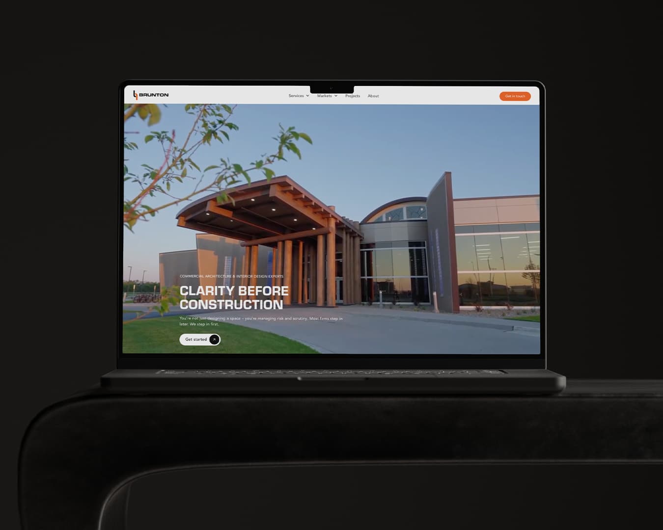
Brunton Architects is proof that a great architecture website doesn't require hundreds of employees or a massive marketing budget. The Minnesota-based firm has built a strong niche serving tribal, civic, and public safety clients throughout the Upper Midwest.
What makes the Brunton website stand out is its focus.
Rather than trying to be everything to everyone, the site clearly communicates who the firm serves, what they do, and why clients choose them. From the homepage hero video to the project portfolio and market-specific content, every section reinforces Brunton's expertise within the sectors they serve.
Why Their Website is One of the Best: The Brunton website makes it remarkably easy for prospective clients to find themselves. Whether someone is looking for a tribal architect, public safety facility designer, or civic architect – the site quickly directs visitors to relevant projects, services, and market expertise. Combined with strong imagery, intuitive navigation, and clear calls-to-action, the result is a website that feels both modern and highly strategic.
Specific features that any architecture firm could seek to emulate include:
- A homepage hero video that immediately showcases the firm's primary markets and project types.
- Clear market segmentation that allows visitors to quickly navigate to content relevant to their industry.
- Dedicated market pages featuring tailored messaging, imagery, and project examples.
- Service pages that explain not only what the firm does, but how those services support client goals.
- A searchable project portfolio with market filters that make it easy to find relevant experience.
- Strong calls-to-action throughout the site that encourage visitors to take the next step.
- Simple, intuitive navigation that makes exploring the site effortless for first-time visitors.
2) Mohagen Hansen
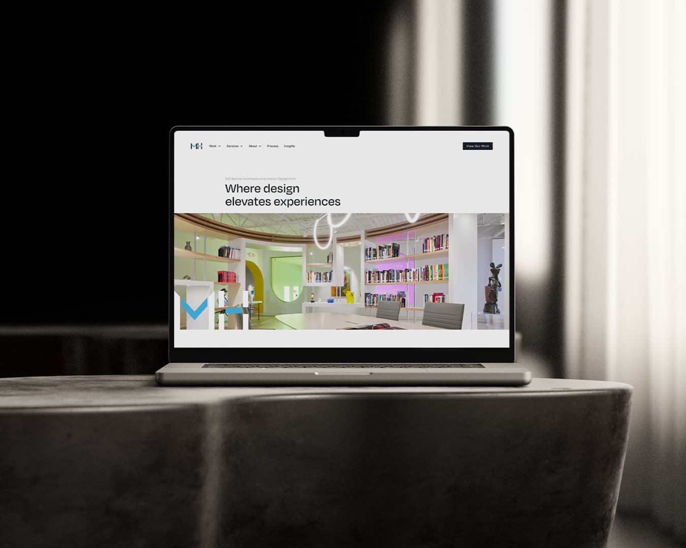
Mohagen Hansen is one of the most trusted planning, architecture, and design firms in Minnesota. And we’re not just saying that because Vnzo AEC has the honor of designing and developing their website! Their work is award winning and expansive, serving a wide range of industries with a particular focus on industrial, healthcare, and office.
Why Their Website is One of the Best: The Mohagen Hansen website does exactly what an architect’s website should do – showcase projects, highlight the markets they serve, and detail the scope of the services they offer. And it does it all with a clean, welcoming, modern aesthetic that reflects their overarching design ethos.
Specific features that any architecture firm could seek to emulate include:
- A homepage headed by a large, cycling display that shows project highlights.
- Clear calls to action (CTA) throughout, including a button directing visitors to “View our Work” in the top navigation bar.
- Easy, logical navigation from the top bar to each relevant industry they serve
3) DLR Group
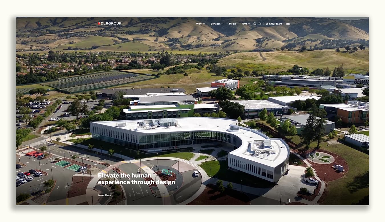
With more than 30 offices and projects spanning education, healthcare, justice, workplace, sports, hospitality, and civic markets, DLR Group is one of the largest and most recognizable architecture firms in the country. Their website reflects that scale, serving as both a portfolio and a resource hub for the wide range of clients, industries, and services the firm supports.
Why Their Website is One of the Best: The DLR Group website excels at helping visitors explore the firm's extensive body of work. Large-scale project photography and video immediately establish credibility, while the site's navigation provides access to a vast library of market sectors, services, thought leadership content, and project examples. Despite the complexity that comes with a firm of this size, visitors can quickly find projects and expertise relevant to their specific industry.
One area where the site could be stronger is messaging. While phrases like "Elevate the human experience through design" communicate the firm's mission, they don't immediately tell visitors what the firm actually does or who they serve. Fortunately, the quality of the project imagery and breadth of experience help fill that gap.
Specific features that any architecture firm could seek to emulate include:
- A homepage video that immediately showcases project quality and establishes credibility.
- Extensive market sector pages that allow visitors to quickly find relevant expertise.
- Strong service architecture that helps organize a broad range of capabilities.
- Project imagery that does much of the storytelling without requiring excessive copy.
- A robust search and navigation experience designed for large amounts of content.
- Thought leadership and media content that reinforce expertise across multiple industries.
- Clear pathways for visitors to explore projects, services, markets, and firm information.
4) Selldorf Architects
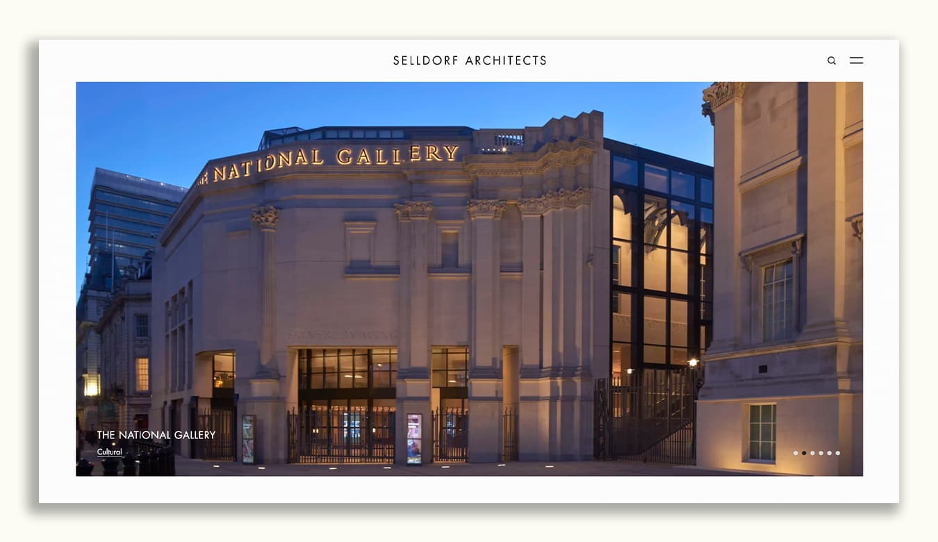
Founded by Annabelle Selldorf in 1988, Selldorf Architects is internationally recognized for its work across cultural, commercial, residential, and hospitality projects. The firm's portfolio includes museums, galleries, academic institutions, and private residences around the world.
Why Their Website is One of the Best: The Selldorf Architects website reflects the firm's design philosophy—simple, refined, and highly intentional. Rather than overwhelming visitors with layers of navigation, messaging, and content, the site focuses on what matters most: the work itself. Large-format imagery takes center stage, while a streamlined navigation structure makes it easy to browse projects by market sector. The result is a website that feels timeless and elegant without sacrificing usability.
Specific features that any architecture firm could seek to emulate include:
- Large, high-quality project imagery that immediately captures attention.
- Simple navigation organized around project sectors rather than unnecessary complexity.
- Minimalist design that keeps the focus on the work rather than the website itself.
- Consistent visual presentation across all project pages.
- Thoughtful use of whitespace and typography that improves readability.
One thing we'd add: Dedicated service pages. While Selldorf's reputation allows the firm to keep navigation intentionally minimal, most architecture firms benefit from clearly explaining their services, expertise, and process to prospective clients.
5) Gensler
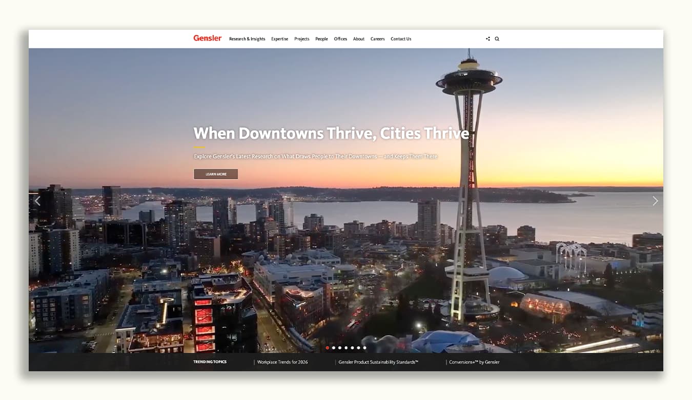
With more than 50 offices around the world and projects spanning nearly every market imaginable, Gensler faces a challenge most architecture firms never will: organizing an enormous amount of information in a way that remains useful to visitors. Their website succeeds by balancing strong messaging, intuitive navigation, compelling project imagery, and a deep library of original content.
Why Their Website is One of the Best: The Gensler website immediately communicates that the firm is about more than designing buildings. Rather than relying on generic architecture messaging, the homepage focuses on broader topics like cities, workplaces, sustainability, and the future of the built environment. Combined with a video-driven homepage, extensive market expertise pages, and a robust research library, the site positions Gensler as both a design firm and an industry thought leader.
Specific features that any architecture firm could seek to emulate include:
- A homepage video that immediately showcases project quality and areas of expertise.
- Strong messaging focused on client outcomes, industry trends, and the future of the built environment.
- Clear navigation that makes it easy to explore projects, services, expertise, offices, and research.
- Dedicated expertise pages that help visitors quickly find relevant market experience.
- A robust research and insights section that supports thought leadership and SEO efforts.
- Frequent publication of original content that keeps the website fresh and relevant.
- Strong calls-to-action throughout the site that encourage deeper engagement.
While most firms won't need a website as expansive as Gensler's, there is a valuable lesson here: the best architecture websites don't just showcase projects – they showcase expertise.
What the Best Architecture Websites Have in Common
While every firm featured above takes a different approach, a few common themes emerge across nearly all of them. Whether you're designing a new website from scratch or improving an existing one, these are the elements worth prioritizing.
1) They Make It Easy for Visitors to Find Relevant Experience
One of the fastest ways to lose a prospective client is forcing them to dig through dozens of unrelated projects.
The best architecture websites help visitors quickly identify projects, markets, and expertise that align with their needs. Brunton organizes content around markets like Tribal, Civic, and Public Safety. Gensler and DLR Group provide extensive expertise pages that allow visitors to quickly find relevant experience.
The lesson: structure your website around how clients search for firms, not how your internal organization chart is built.
2) They Clearly Communicate What Makes the Firm Different
Many architecture websites rely on vague messaging about innovation, collaboration, or designing inspiring spaces.
The strongest websites go deeper.
Brunton focuses on providing clarity before construction.
Gensler positions itself around research and the future of the built environment.
Selldorf emphasizes restraint and elegance through both its work and presentation.
Visitors should be able to understand what makes your firm different within seconds of arriving on your website.
3) They Let the Work Speak for Itself
Architecture is inherently visual.
Every firm featured in this article relies heavily on project photography, video, and project storytelling to establish credibility. Large-scale imagery creates an immediate impression and helps visitors envision the quality of work your firm delivers.
Your website should showcase your best projects prominently and make them easy to explore.
4) They Guide Visitors Toward a Next Step
A surprising number of architecture websites function like digital brochures – beautiful to look at, but difficult to engage with.
The best websites provide clear paths forward. Whether that's exploring projects, viewing market expertise, contacting the firm, or reading thought leadership content, visitors are never left wondering what to do next.
Good design isn't just about aesthetics. It's about helping users accomplish their goals.
5) They Position Expertise, Not Just Projects
Projects matter. Expertise wins work.
One reason firms like Gensler and DLR Group perform so well online is that they don't rely solely on project portfolios. They also showcase research, market knowledge, industry trends, and specialized expertise.
For many prospective clients, understanding how your team thinks can be just as important as seeing what your team has built.
6) They're Built to Grow With the Firm
A great website isn't a one-time marketing project.
The most effective architecture websites are easy to update, expand, and improve over time. New projects can be added quickly. New market pages can be launched. Content can be published without rebuilding the entire site.
The goal isn't simply to launch a beautiful website. The goal is to create a platform that supports business development and marketing efforts for years to come.
Final Thoughts
There is no single formula for a great architecture website.
Some firms lean into simplicity. Others prioritize thought leadership. Some organize content around markets, while others focus almost entirely on their work.
What the best architecture websites share is a clear understanding of their audience. They make it easy for prospective clients to find relevant experience, understand the firm's expertise, and take the next step.
Want a Website that Works Harder for Your Firm?
If your website isn’t reflecting the excellent quality of your work, attracting organic leads in the process, then it’s not doing its job. That’s where we come in.
With Vnzo AEC, you can fire your underperforming design and develop a webpage that’s truly top-of-the-line. Your work is something to be proud of, and we’ll build you a site that reflects that with a beautiful, intuitive design. Schedule a consultation today to see what Vnzo AEC can do for you!

Get AEC Marketing Insights That Actually Work
Weekly strategies that grow your firm


.jpg)